Disclaimer: This is a process for editing and coloring my traditional media sketches that I have acquired over time. I don't claim it's a good one! 🙃 I use multiple processes for various outcomes, this is just one of them.
What's important for me:
- it's a non-destructive approach
- each step can be adjusted at any time during the process
- the traditional look won't be lost
Important to know:
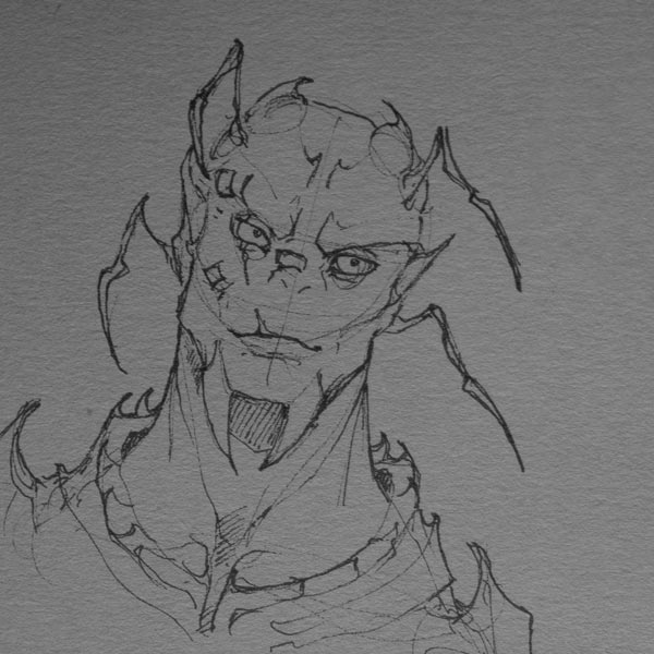
- I work with layers
- with each step I add 1 or several layers
- each layer is added on top
- thus, the original sketch is on the very bottom
- this approach works for Photoshop and similar apps
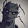
And here are all my layers:
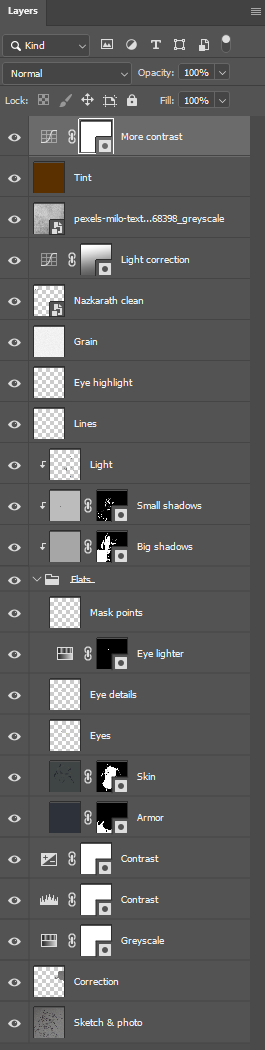
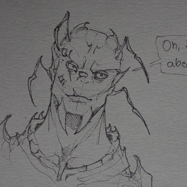
Sketch & photo
For sketching I use:
- fineliners (aka "pigment liners") from Staedtler with 0.1 and 0.3 thickness
- paper from Stillman & Birn, Nova Series Grey Toned 150g
For taking the photo I prefer indirect sunlight. The subject should be evenly illuminated, without shadows and photographed from a 90° top-down angle.
Correction
I didn't like the speech bubble, so I..
- selected it with the "Lasso tool"
- chose "Content-Aware Fill" from the context menu
This allows me to mark an area which will be used as a sample for the fill. As I marked an empty area on the paper, I got more paper, but as a new layer on top of the speech bubble.


Greyscale
With a "Hue/Saturation" adjustment layer I set the saturation to 0. I do this, because I don't want any colors from the photo to interfere with the colors I'll add later.

Contrast
There are many ways to increase the contrast:
- "Brightness/Contrast" layer:
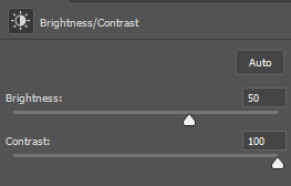
- "Levels" layer:

- "Exposure" layer:

For me it's either 1 of the above mentioned layers or a combination of 2. The values depend on the photo - they are never the same. I want to make the lines pop, but without loosing the paper texture.

Colors
For colors I use layers with various "blend modes" to preserve the original paper texture and my lines. If I just used a layer as it is (=blend mode set to "Normal"), my brush strokes would cover everything below completely and my traditional sketch would be lost.
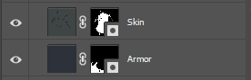
Dark colors
I figured that dark colors work best with the blend modes "Hard Light" or "Multiply". For my character I created 2 new layers for the dark colors and set them to "Multiply". It's not necessary to use 2 layers or the masks (= the black and white thingies on the right). I just find it more convenient to separate things and to work with masks.
That's how (shitty) the color layers look like with blend mode set to "Normal":

Light colors
For light colors I usually use the blend mode "Overlay".
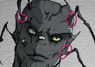
I created new layers for the eyes and the three points around his scarred eye. I also lightened up one eye with an adjustment layer and added more details to the eyes.


One folder for all my color layers
I put all my color layers into one folder called "Flats". This is necessary to make my life easier in the later steps.

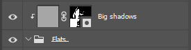
Big shadows
Careful: It gets complicated. For the simpler approach check out "Highlights", but use the blend mode "Multiply".
The big shadow is the "main" shadow that usually spreads over bigger areas. It has its own layer which is placed above the "Flats" with something called a "Clipping Mask". The clipping mask assures that everything I paint on the shadow layer is only visible on top of my colors aka my character.
Why would this be necessary though?
- I want to be able to tweak the color and strength of my shadow anytime without touching its shape
- I don't want to care about the color of the shadow while painting it onto the character
- I don't want to accidentally paint the shadow onto the background
So here is what I did:
- I created a new layer and set the blend mode to "Multiply".
- I filled the layer with a light grey color (I like to make it a blueish grey, though I can re-fill it later).
- I right-clicked on the layer and chose "Create Clipping Mask" (this will prevent me to accidentally paint onto the background).
- Additionally, I created a "Layer Mask" on the shadow layer (that's the black and white thingy). The layer mask will appear white, though I inverted it to black.
- From now on, I'll only work on the layer mask - which is in greyscale (black = no shadow, white = shadow).
- I used the "Lasso tool" to select an area and filled it with white.
- I repeated this until I "cut out" all my big shadows.
- Sometimes, I also use brushes to make the shadows softer.
- Afterwards, I usually switch back to the color part of the layer and try out different shadow colors. Hint: The lighter the color the lighter the shadow.

Small shadows
I do the same for smaller shadows. For me these are usually somewhere inside the bigger shadows.

Highlights
I sometimes draw the highlights with more layers - and with layer masks - but this time I just opted for some simple streaks. So,...
- I created a layer and set the blend mode to "Linear Dodge (Add)"
- I color-picked where I wanted to draw and made the color a little lighter
- I drew the streaks with a brush or the lasso tool


Lines
I like to add some lines to separate specific parts of the character from each other.
Eye highlight, grain & "logo"
The eye highlights are just some white dots on a separat layer. The grain is yet another layer filled with white to which I applied a "Grain" filter and set the blend mode to "Multiply". Then I lowered the opacity to make it less grainy.
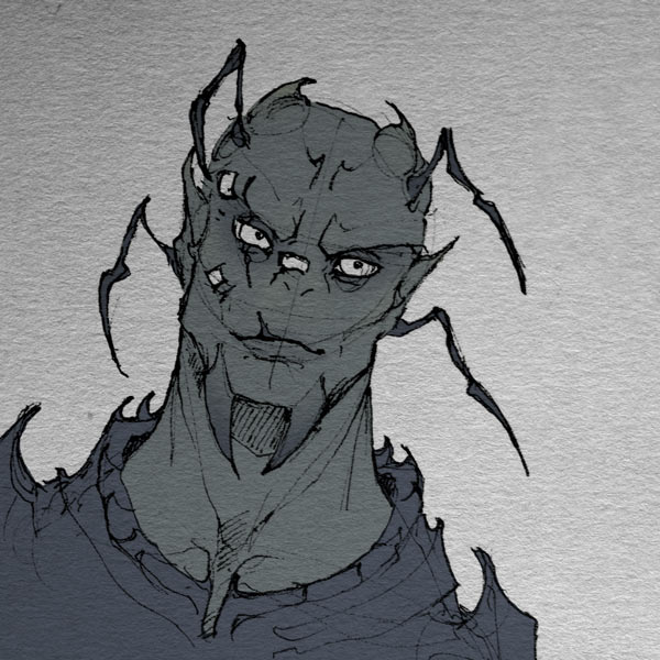
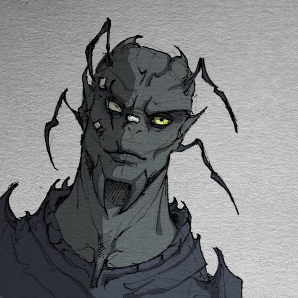
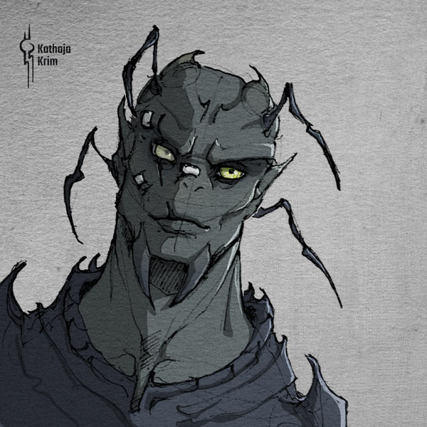
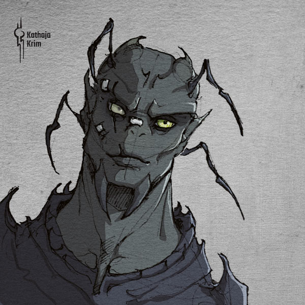
Fun fact: My logo is actually the symbol of this character's family. The character is called Zhaikes and the family's name is Nazkarath.


Light correction
I realized that my photo was not illuminated evenly (the top was darker than the bottom), so I correct it with a curves layer and a gradient mask - though I have no idea how to describe this magic properly 😅


Texture
I wanted more texture, so I added a photo texture and set the blend mode to "Darken" and the opacity to 45%. I recommend Milo Textures from Pexels, they are amazing.

Tint
I love tint, just saying. The tint is a layer filled with a reddish brown color, blend mode set to "Lighten" and opacity to 12%. This adds a reddish brown tint to all dark areas.

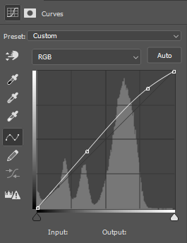
More contrast
Last step: Cranking up the contrast. I do this at the very last and on top of all my layers to give it the final touch. It's a "Curves" layer with a soft "S" shape. The "S" shape can be more pronounced, but this time I just wanted the highlights a little lighter and the shadows to stay the same.

That's it!
Very technical and confusing, I am aware. I mainly created this for myself, so I can remember my steps. But if you can re-use even just parts of it, feel free to do so too! And if you like then show me your creations.
Andris' eye colors
Here is Andris Rayson, featuring her dark blue contacts (1st pic) and her icy-blue eyes (2nd pic). Andris opts for contacts and the pink wig to avoid drawing too much attention to herself. Her species, the Minār, a human colony, aren't entirely welcome at Set Il Rega, which is the space station she currently resides on. Consequently, she strives to mix in with the human-like Baralimsa residents, who usually have colorful eyes and hair.


About World of Krim and my novel
I somehow feel the need to finally explain this. So, here it is, the explanation to where my creations come from and how they relate to each other.
World of Krim - the setting
"World of Krim" is my fictional universe, the overall world in which my creations live in. Currently, it includes 5 galaxies, 15 planets, 12 extraterrestrial species and a lot of creatures.
9 of the species are part of a federation named Araz:
[Zhor Khat] – 1. Nation & “the founders”
[Darakay] – 2. Nation
[Var'U'San] – 3. Nation
[Baralimsa] – 4. Nation
[Vortecc] – 5. Nation
[Ophreqsus] – 6. Nation
[Karyta] – 7. Nation
[Arka] – 8. Nation
[Nan-Te'gah] – 9. Nation
And others:
Humans play a role in my setting too, but Earth is far away and basically unaware of what’s going on in the other galaxies. However, there have been events – many hundreds of years ago – where far too many humans were abduc.. er separated from Earth by the Var'U'San. The action was not entirely ill-intended, and the two species lived side by side for decades, but in the end the humans gained the upper hand and wreaked havoc in my universe. Those humans are called Minār and aren’t friends with the federated nations.
Fremdling - my novel
"Fremdling" is the German world for “Strange-ling” and the name of my novel. The story takes place in the setting described above. It revolves around Lara Hollis, a human woman, who accidentally strands on a giant space vessel, the Arak'Tera, the frightening flagship of the Zhor Khat.
In her desperation Lara strikes a deal with Zhaikes Nazkarath, the leader of the Zhor Khat, and one of the most influential people in my world. He offers to take her home, but first she must do him a favor. In the meantime, Lara has no choice but to stay on his ship for a while – as the only human in a completely alien world. It doesn't take long until she runs into trouble, and Zhaikes of course.
Oh, and I should probably mention that the plot has a focus on romance. So, yeah, it’s some sort of science fiction adventure with an “enemies to lovers” trope and a lot of world building.
Status of the novel: About 80% is done, but honestly, I have no idea if I want to publish it and how and where. Maybe it will just stay my personal project after all~
1k sketch raffle [CLOSED]
I hit 1k today <3
maybe some of your are interested in a small sketch raffle?
how to participate:
comment with a link to a character or species
make sure that I'm allowed to draw what you submit
1 submission per participant
you must be a watcher
sharing this journal isn't mandatory, but feel free to do so
deadline:
13. April 2023, midnight GMT
I'll randomly select one participant
please take a look at my gallery to see what I usually draw. if your submission is completely out of my comfort zone, I reserve the right to make a new selection.
the winner will get:
a sketch made by me with lots of gratitude
I'll post the sketch and tag the winner as soon as I can
pose, medium and style is my choice - let me surprise you :}
yep, that's it. I've never done this before so.. good luck? ^^' & thank you for all your support! it means a lot to me.
something that should be said more often
hi y'all!
as I feel like some people have left this place, I just wanted to say thank you to everyone who is still here and enjoys my art - no matter if you do that silently or in an active manner. I appreciate all of it.
why am I telling you this now? during the last year(s), I strongly focused on sketching and exploring. I stopped thinking about what others might like and if "I can even post this ***" and the result was, that I've learned a lot, even if I think it isn't strongly visible in my uploads. after all, it's usually just sketches. but, and that's probably my point, even though I focused on sketching so much - and I know the interest in sketches isn't usually that high - yet many of you stayed with me and appreciated them after all. which is amazing and I'm forever grateful for this.
so, this message is for you, to all the people who are silently or actively watching my aliens. thank you <3